Business plans are documents that outline the details of a business – usually a startup – and define its objectives and how to achieve specific goals. It’s a written roadmap from marketing, financial and operational perspectives.
What’s missing in most business plans is any specifics about the business brand. Most often a ‘brand’ is associated with a company’s ‘logo’. A better concept is the company’s logo helps define the company’s visual brand – the look, feel, gestures, colors and language for the business.
Companies with great visual brands include: NIKE, Starbucks, 3M and McDonalds. These companies have such good brand equity, customers know the company by simply a color, a sound or a look. Consistent brand equity builds loyal customers and increases revenue.
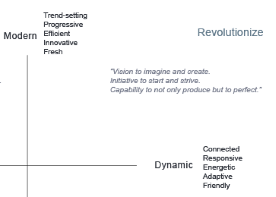
The three ways visual frames build brand equity is by describing the brand, identifying brand colors and by comparison plotting.
1) Brand Descriptors
It’s critical for executives and key decision makers to align in how the company is described. Descriptors that paint a picture of what the brand is, how it works and why it’s important will allow differentiation.
Once the company is aligned on how the brand is defined, decisions are easier to make. Does this logo concept align with what is defined? Does the company tagline fit the brand description?

2) Color Palette
The beauty of defining a brand with adjectives describing the wants and feels for a company is that designers can interpret the descriptors and generate brand colors.
Colors are key for brand definition. Green is the color of Starbucks. It hasn’t changed in decades. Red is the color for 3M. It hasn’t changed in decades. Yellow is the color for McDonalds. It hasn’t changed in decades. Defining primary and complimentary colors that will build your brand equity, so people can identify your brand by the color on a coffee cup in Hong Kong, is key. Having a color palette that meets key brand attributes consistently drives design decisions that build brand equity.

3) Comparison Plots
The third thing brand frames facilitate is communication. Plotting competitors relative to your brand clearly communicates market opportunities and how to delineate your company name, products and graphics from existing companies.
Comparison plots are a catalyst for brand strategies, collaboration across work groups and make for easy decisions when it comes time to choose the best tagline, logo or product color. A picture is worth a thousand words, they say, but in the brand equity world, it can be worth millions.

